There are several reasons why we believe that visual representation of data is becoming an integral part of Big Data analytics or any other kind of data-driven analytics, for that matter
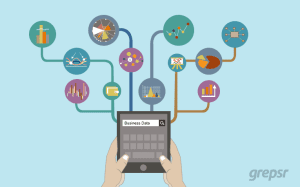
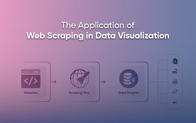
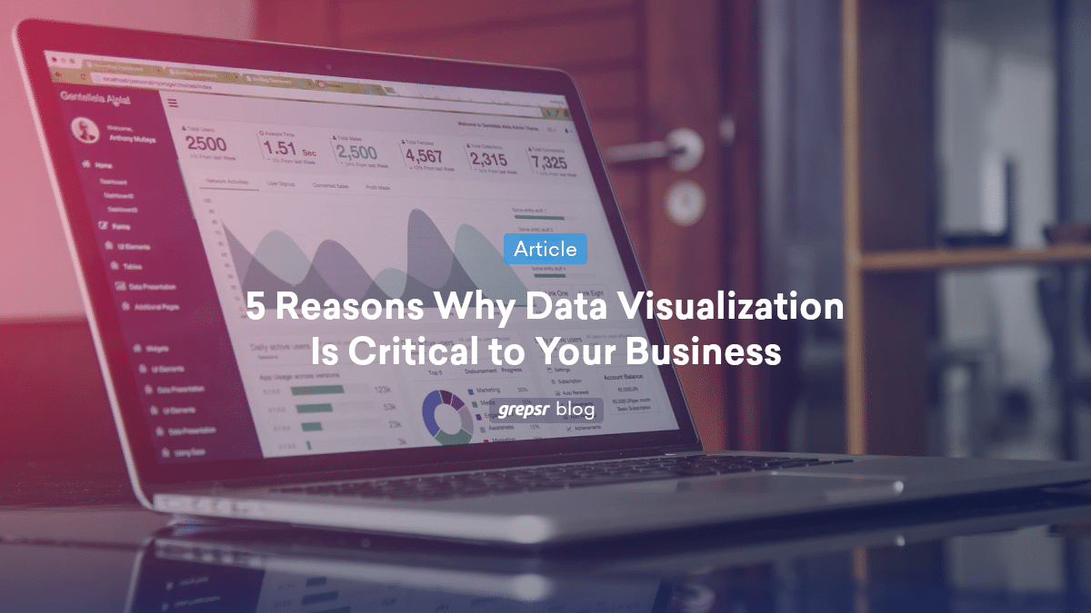
Visual display of data makes the whole process of data analytics a lot easier and less complicated, adding an extra dimension to our understanding of data. Data analytics begins with web crawling and data mining, and ends with data visualization.
Of the various reasons why you need to consider incorporating data visualization into your data-driven business strategies, the following are worth mentioning:
Human mind processes the visual information better
The evolutionary process has wired human brain in such a way that we find visual information more intriguing and meaningful than any other form of information. It takes a fraction of a second (about 250 milliseconds) for the brain to grasp, comprehend, and respond to the information that comes in the visual form.
Even the large part of our thinking involves visualization, and there is a very strong correlation between visual perception and retention, which is to say that you are far (about ten times) more likely to remember visual information compared to the textual one.
Visualization tells the story of the unseen patterns
Another important characteristic of human mind is seeking patterns and telling stories. By blending art and statistics together, data visualization meets our aesthetic desires (to see vivid and colorful patterns and to connect the dots among them) and business needs at the same time.
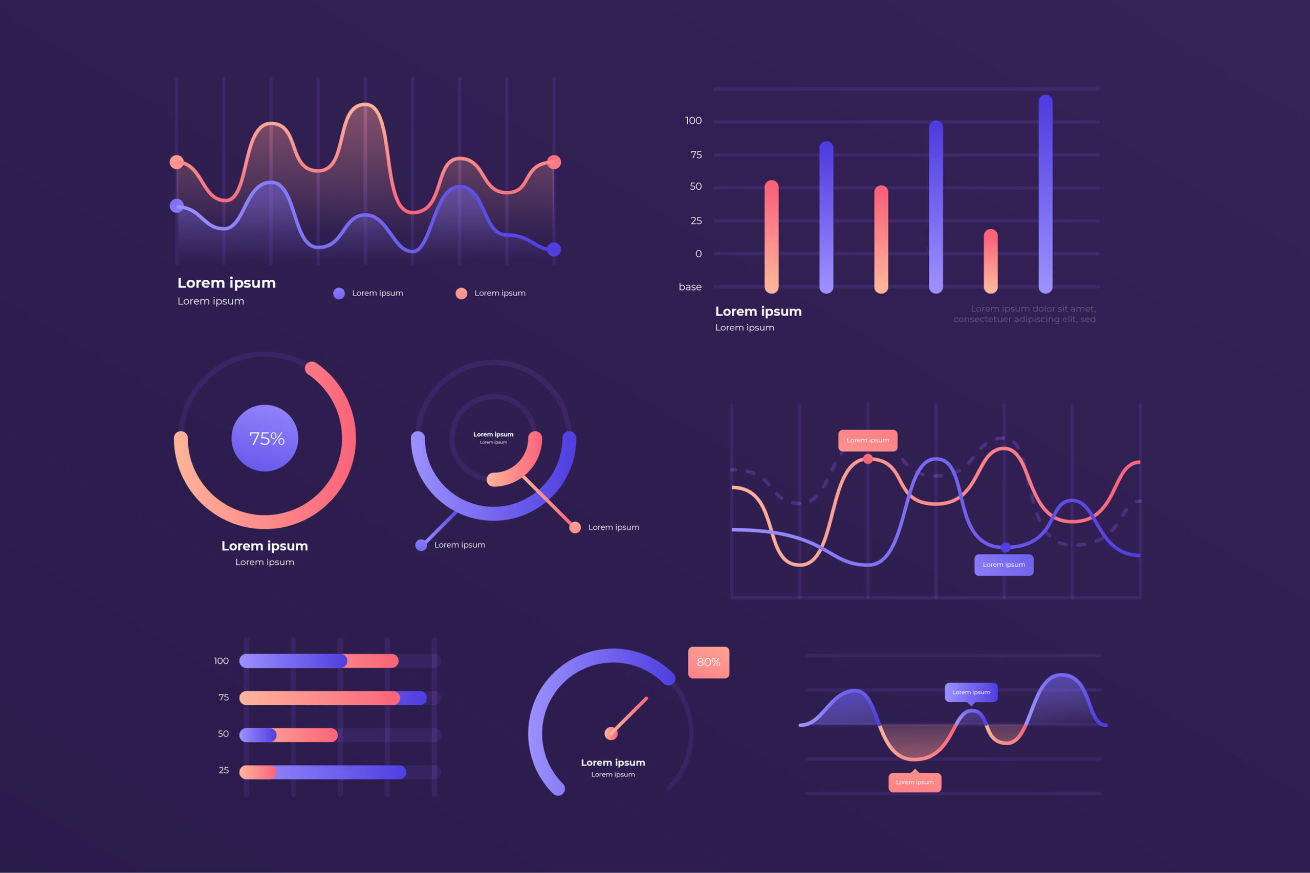
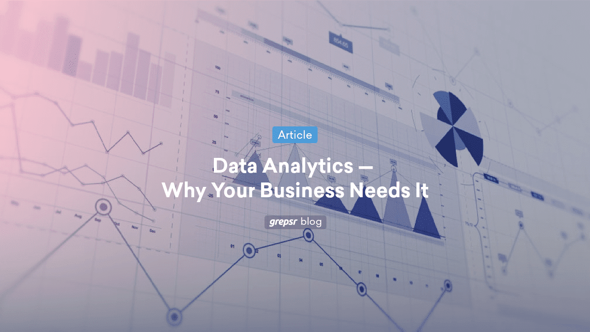
Data visualization presents color-coded charts, graphs, animations, maps, diagrams, wordles, pictograph, infographics etc., and helps us to discover the unseen patterns, correlations, gaps and trends existing in the data. It makes business/data analytics quick and simple.
The greatest value of a picture is when it forces us to notice what we never expected to see.
John W. Tukey

A picture is worth a thousand words
One reason why you need data visualization is information overload caused by the explosion of data. Visualization boils the information down to its essence and depicts it in the simple and elegant images. It helps you to focus and shed light on the aspects that are important for you.
When you have too much of data but too little time, data visualization serves you the best by providing a window into the bigger picture. You can also use data visualization during the brainstorming sessions by displaying what you mean without telling much.
By visualizing information, we turn it into a landscape that you can explore with your eyes, a sort of information map. And when you’re lost in information, an information map is kind of useful.
David McCandless
Interactive visualization tools help getting better insights
What makes today’s data visualization different from traditional data representation is its interactive nature. Using the advanced dataviz tools, you can model and remodel your data to visualize the possible outcomes of your business plans and strategies, and see what work better.
Another best thing about the visualization apps, tools, and services is that you don’t need to be an artist or a data scientist to convert your data into visual forms. The opportunity to compare, contrast, and simulate data by interactive visualization helps the users to explore deeper and develop better insights on the broader spectrum.
Visualization drives online traffic
Data visualization is not just an effective way to conduct web analytics by seeing the patterns, trends, and frequencies of the traffic flow to your website, it can also improve online traffic and user participation. According to an estimation, “45% more web users will click on a link if it features an infographic.”
The deeply-ingrained human fascination to colors, shapes, and patterns does the trick. Visual appeal is precisely the reason why Pinterest, the photo-sharing website, has emerged as the 3rd most popular social networking site.
Getting the right data counts
The main purpose of data visualization is to communicate information with precision, accuracy, and objectivity. Before you begin representing and designing your data into a visual form, what you first would want to have is the high-quality actionable data that can be readily visualized.
Grepsr has gained a lot of trust and credibility for its high-quality data during its partnership and collaboration with its customers worldwide. Along the way, we have also achieved significant expertise in preparing data that goes for visual marketing.
When it comes to data visualization, it is important to know what structure of data best suits the specific form and function of the visualization. Quality, no doubt, is a prerequisite.

Related reads:


