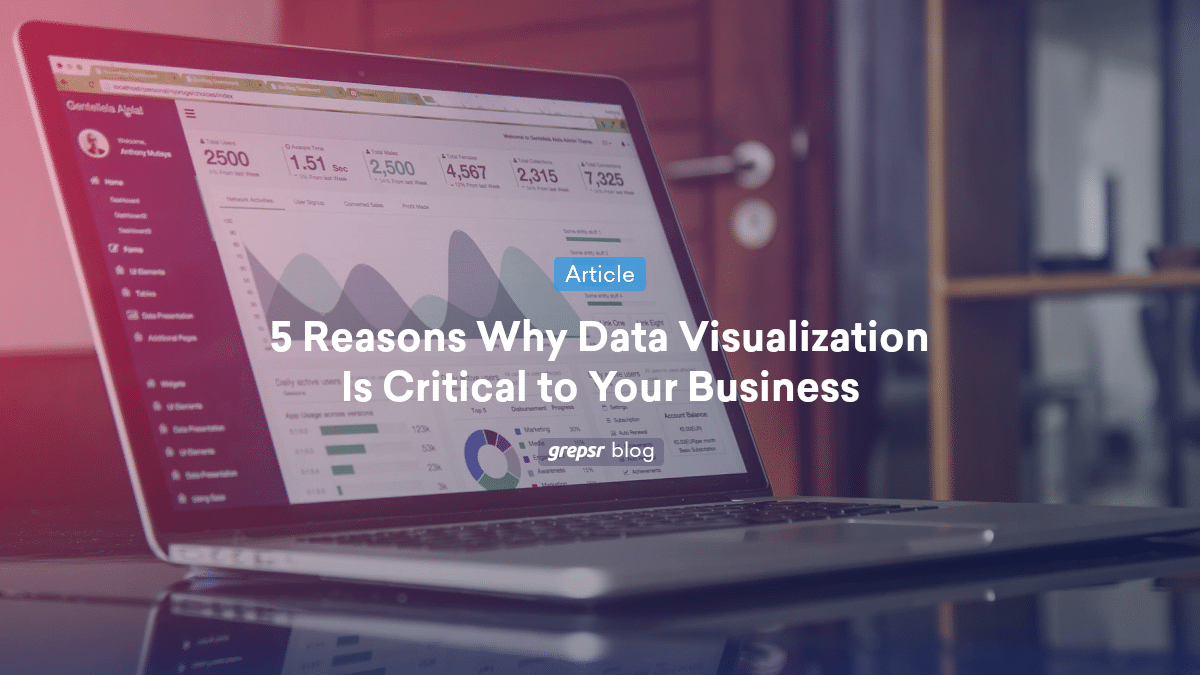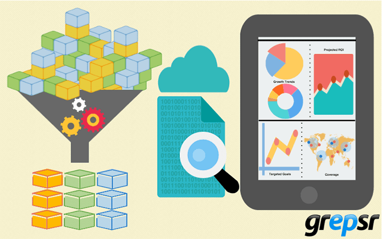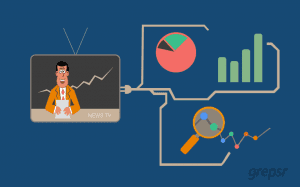
In a world where data reigns supreme, the ability to make sense of the overwhelming volume of information is nothing short of a superpower. Harnessing the power of data visualization in Python is a superpower in itself. From interactive charts and graphs to immersive dashboards, visualization helps businesses and individuals gain insights from data.
But what data fuels these visualizations? Where can you find it? And how can you create impactful data visualizations?
This article delves into the world of data visualization using Python, exploring different types of data visualization, providing examples, and emphasizing the importance of interactive data visualization.
What is Data Visualization in Python?
Data visualization in Python involves representing data in graphical or chart formats using Python libraries like Matplotlib, Seaborn, and Plotly. Python is a popular choice for data visualization due to its versatility and extensive libraries.
What Data is Used in Data Visualization?
Data visualization is all about making sense of data. To create compelling visuals, you need the right data. This data can come from various sources, including databases, spreadsheets, and the Internet. Web data is a valuable resource for enriching your visualizations with real-time, external information. For instance, you might want to create a visualization showing stock market trends, real-time news updates, or social media sentiment analysis.
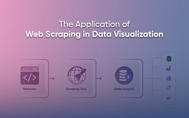
How Do You Find Data for Data Visualization?
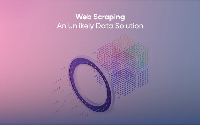
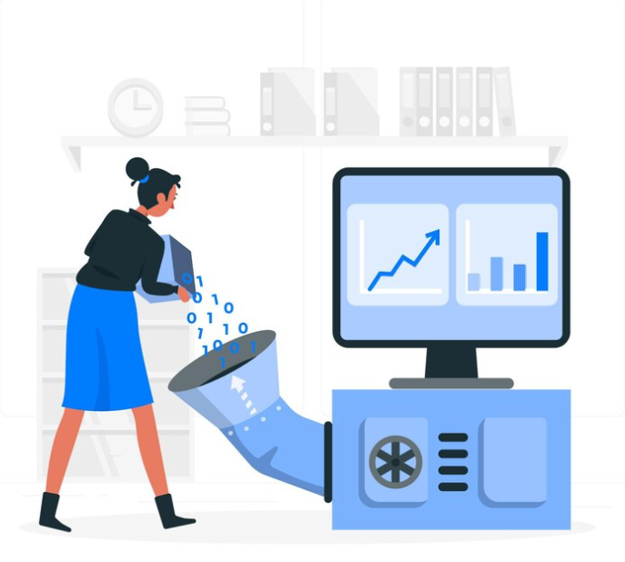
The web is a treasure trove of data, but harnessing it for visualization can be challenging. This is where Grepsr steps in. With its robust web scraping capabilities, Grepsr automates the data extraction process from websites, making it easy to access a wide range of structured and unstructured data. This includes extracting product prices, stock market data, news articles, weather forecasts, and much more.
What is an Example of a Data Visualization?
To understand the power of data visualization, let’s consider an example. Imagine you’re a marketing analyst aiming to create a visualization that shows the distribution of your brand’s mentions on social media platforms. You can use Grepsr to scrape data from social media platforms, tracking mentions, likes, and comments. With this data, you can create a visual representation of your brand’s online presence, helping you gauge your social media performance and identify trends.
Interactive Data Visualization in Python
To take your data visualization to the next level, you can create interactive data visualizations using libraries like Plotly. Interactive visualizations allow users to explore data and gain deeper insights.
Interactive Data Visualization Example
Suppose you have a dataset containing information about stock market trends. You can create an interactive data visualization in Python using Plotly to allow users to zoom in, pan, and get more details on specific data points. Furthermore, making it easier to analyze and interpret complex datasets.
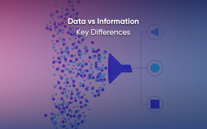
What is a Dataset in Data Visualization?
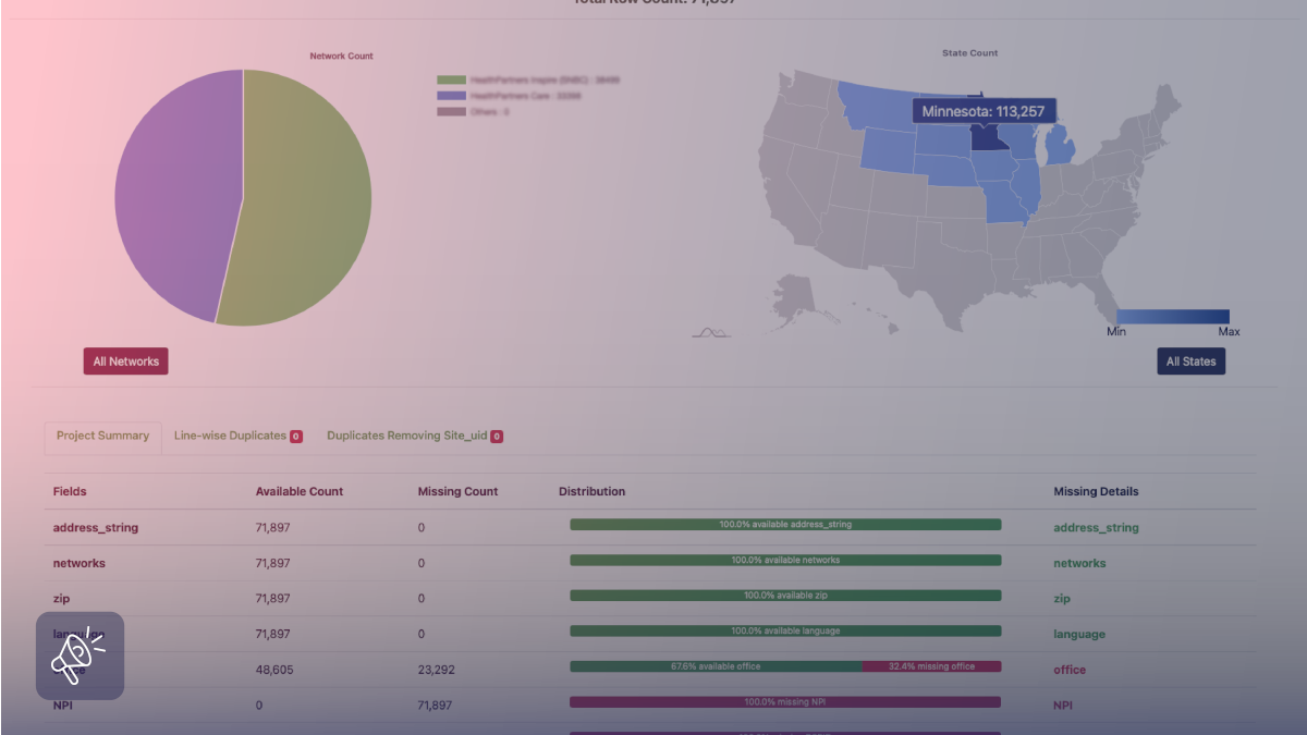
In data visualization, a dataset is the foundation of your visual representation. It’s a structured collection of data points that are organized for analysis and presentation. These datasets can be obtained from various sources, and Grepsr ensures you have access to high-quality, up-to-date datasets from the web. With Grepsr, you can retrieve data in various formats, such as CSV, JSON, or Excel, making it ready for analysis.
Leveraging Web Data with Grepsr for Data Visualization
Data extraction, particularly from the web, can be a game-changer in the field of data visualization. Grepsr offers several advantages that enhance this process:
- Accuracy and Reliability: Grepsr ensures data accuracy by regularly updating the scraped data. This guarantees that your visualizations are based on the most current information.
- Customized Data: You can specify the data you need and Grepsr assures the precise information that matters for your projects.
- Automation: Grepsr automates the data extraction process, saving you time and effort, whether you need data on a daily, weekly, or real-time basis.
- Scalability: Whether you require a small dataset or extensive information from multiple websites, Grepsr can scale to meet your data needs.
- Data Enrichment: Grepsr can not only scrape data but also enrich it by transforming unstructured data into structured, machine-readable formats.
How Grepsr Empowers Data Visualization
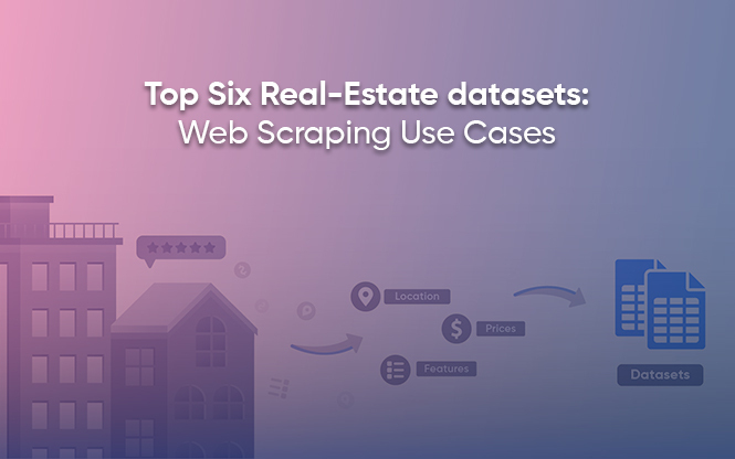
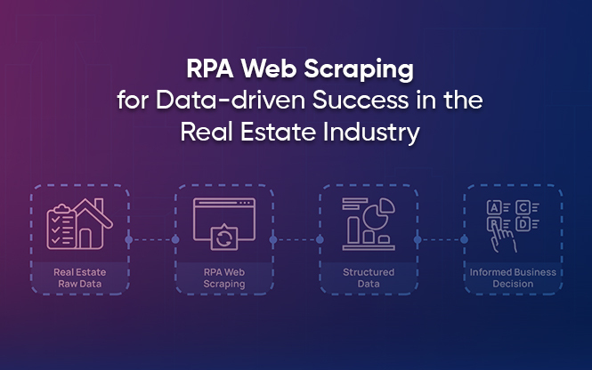
Imagine you want to create a data visualization for a real estate market analysis. You need data on property listings, prices, and market trends from various real estate websites. As mentioned above, Grepsr can automate the extraction of this data and provide it in a structured format, making it easy to visualize market trends and opportunities.
Grepsr in Action: A Real-World Example
To illustrate the impact of Grepsr on visualization, let’s explore a real-world scenario. Suppose you run an e-commerce business and want to visualize competitor pricing. By using Grepsr to scrape competitor websites for product prices, you can create pricing comparison visualizations, helping you make informed pricing decisions and gain a competitive edge.
Unlock Data-Driven Success with Grepsr
Visualizing Data is a vital tool for understanding complex data, and the data that fuels these charts can be found in a myriad of sources, including the web. Grepsr’s web scraping service simplifies the process of gathering data for your projects, offering reliability, automation, and scalability. Whether you’re a marketing analyst, business owner, or researcher. Subsequently, analyzing social media trends, real estate markets, e-commerce prices, or any other field. Grepsr empowers you to extract valuable data from the web, enhancing your visualization capabilities and enabling data-driven decision-making.
Therefore, incorporating web data with Grepsr into your visualization projects can unlock new insights and drive data-driven decision-making. Grepsr is your reliable data extraction partner in acquiring the data you need to create an impact.